Spotify Concept: Designing to Discover Songs that I Actually Want to Listen to
March - May 2022
Role: Product Designer, User Researcher
Type: App Feature Prototype
Case study link: Medium article
Imagine this: you’re scouring Spotify for new songs to add to a new playlist that’s going to become your personality for the next three weeks. Or you’re spending more time skipping than actually listening to songs in your Daily Mix 1. Sound familiar?
Spotify has many ways of letting users discover new songs, ranging from the search bar to personalized playlists . But, it’s still hard to easily find songs that users will love listening to more than once because…
it’s a lot of effort to search for new songs on your own, especially when you don’t know where to start
Spotify doesn’t provide a sufficient number of recommendations for you to choose from (the chances of your liking those songs is low)
there isn’t an easy way to find out whether you’d like a song by just seeing the title, artist, and without listening to it in its entirety
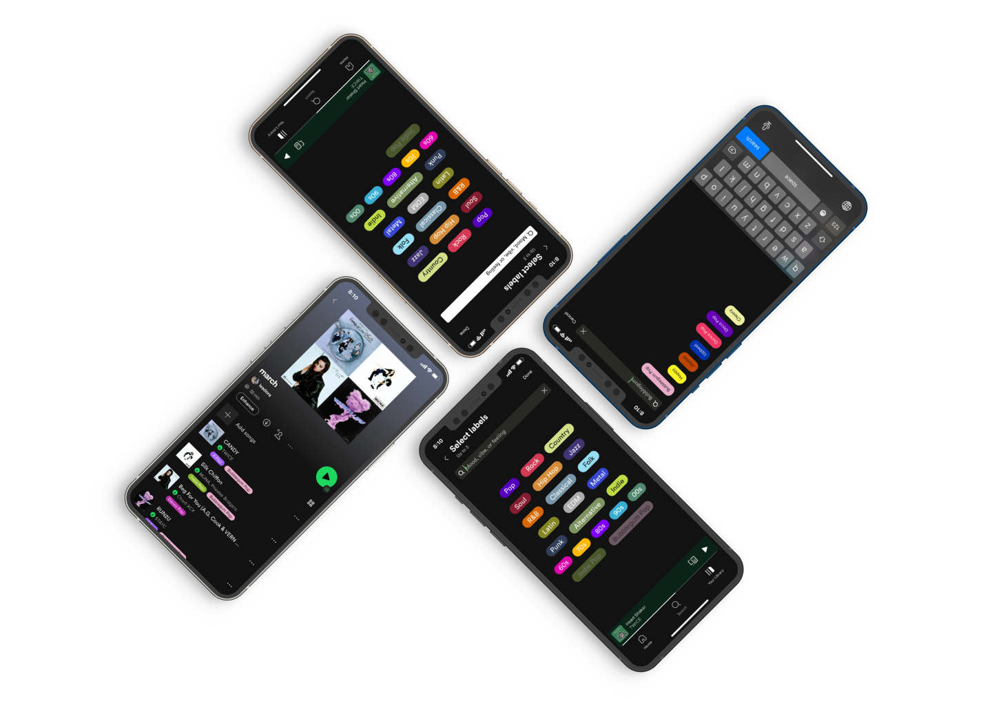
Final Prototype
Your Daily Mix Isn’t Enough
Going into this study, my original hypothesis was: If Spotify’s recommendations were better suited for users, then users would rely more on Spotify for finding new songs that they like.
Understanding Why Users Don’t Rely on Spotify’s Recommendations
User Research
My goals were to find out how, where, and how long it takes users find songs they like. Along with users’ method of listening, users’ method of organizing their songs interested me. After interviewing three Spotify users, I discovered that:
users have a method of listening (it’s not random) → users organize their music into playlists that have the same sound or vibe
users want to and like finding songs to listen to on repeat → users listen to the same songs for a few weeks before finding new ones (cycle repeats)
users are more confident that they will like the music they find on their own and might trust themselves more than Spotify → majority of users’ playlists are ones they made themselves
but, users don’t completely distrust Spotify’s recommendations. → users find 1–2 Spotify song/playlist recommendation tools helpful to find new songs to listen to, such as personalized playlists or artist radio
users also aren’t fully responsible for finding all the songs they like and stumble across songs intentionally or unintentionally online → Instagram, Tiktok, or even by word of mouth
Market Research
Current alternative solutions to finding new songs include Apple Music, TikTok, Soundcloud, Youtube and Youtube Music, online and offline radio, and word of mouth.
Subscription-based streaming platforms (Apple Music, Youtube Music, iHeart Radio, Soundcloud Go+) offer users a ton of songs, but nothing tackles the people problem at hand. TikTok is interesting, but how do you get on “music TikTok” (i.e. constantly see music-related TikTok videos on your For You Page) and stay there? Soundcloud and Youtube allow users to comment on songs, letting other users gauge what the song at hand might be like, but it’s still not that specific and cluttered. Spotify combines the variety of music other streaming platforms have + social aspects + recommender system algorithms.
People Like Looking for New Songs, but Sometimes it Takes Too Long
At first, I thought that people usually listen to their own playlists because they think Spotify’s recommendations aren’t accurate. Instead, users are more inclined to listen to their own playlists because they like and put in effort into making them.
People want to discover new songs to listen to on repeat, but there isn’t a method of looking for these songs without spending a lot of effort.
Thus, my hypothesis only took Spotify’s recommendations into account for how users find new songs. From users I learned that the search and listening process is just as, if not more, important and relevant to their goal of discovering new songs to like.
Determining Which Feature to Explore
Initial Brainstorm
I recruited two of my friends to help me brainstorm, and we came up with a bunch of “How Might We’s” — questions to prompt how we might go about thinking about solutions.
After aggregating them into four different opportunity areas, we brainstormed various solutions.
From there, we further organized our ideas into different solution spaces. After selecting three out of five ideated solution spaces, we voted on six individual solutions to explore.
Low-Fidelity Prototypes
From these solutions, I compared their strengths, weaknesses, potential opportunities, threats, and feasibility. Then, I selected three to proceed with and test:
in-app song sharing
song previews
individual song labels/markers
The feature I decided to go with was #3 because I wanted to tackle point #3 in my people problem. The feature’s visual descriptors of songs tell users what a song is like without having to listen to it (in its entirety).
Making the Invisible Visible
Spotify already has genres and subgenres attached to songs, as seen in Spotify Wrapped’s “You listened to ___ genres this year,” but users can’t view a song’s genre/subgenres from the app. Songs are categorized by an algorithm or a human in playlists, but… everything’s just pop, right? Users don’t know the difference between two songs in a particular playlist without listening to them both first.
So how can we make the invisible visible to users to enhance their music-discovering process? Song labels.
So how does it work? Every song on Spotify would have one label already added to it: it’s general genre. Users can add two more labels of their choosing from a label database that’s similar to Spotify’s genre library. Labels won’t only be genres and subgenres, though–they can also be adjectives that describe the mood, vibe, or feeling that the song evokes. Labels are discoverable in that they are public and users can tap on them to find other songs with the same label.
Feature Design Iterations
In this process, I explored various entry-point flows, and decided to design i.) how users can add labels to songs in their playlists and ii.) how labels appear next to songs.
For the label design, I wanted to utilize elements that already existed in Spotify’s design, like rounded-edged rectangular buttons, a search bar, and pops of solid color (Wait, really? Check out the “Search” page — I thought Spotify only used black, gray, white, and green, too). The main content requirement for this part of the feature were the genre names, which appear on the labels and in search.
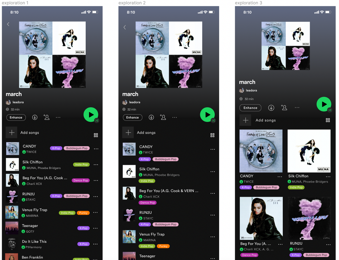
I experimented with three different UI designs for label selection, shown above. 1 and 2 use a plus button, which attempted to signify “press this to add more labels” to users. Some of my interviewees were confused by what the plus sign meant (not intuitive), and the location of the button in flow 2 looked a bit off, though it was right by the users’ thumbs. 3 has a visible search bar at the top of the screen, which users navigated to without hesitation during the user interview.
After conducting my user interviews and gathering my insights, I came up with four explorations from the three flows shown before.
One “type” I ideated was a cluster of labels of common genres along with a way to search or add less-common genres.
The second “type” was a vertical list of the same labels with a search bar. After experimenting and doing user tests, I found that users thought it was easier to add a new label with the search bar over the search button (B). I decided to go with exploration A after hearing positive feedback from the user tests on the cluster list being easier to read and that it didn’t require scrolling (C + D).
In addition to the user interface of adding labels, I explored how labels appear next to songs. After experimentation, I saw that the current design of playlists looks spacious enough for the labels… but where? In the three iterations of the label design, users found the buttons in exploration 1 to be too close to the meatball menu (“…”) on the right side of each row, and there were concerns of accidentally tapping it or the wrong label. I went with exploration 2 since the labels seemed to merge into the current Spotify design without causing the user to waste any time.
Final Interaction Flow
From these different explorations, I came up with four different flows with the three different entry points and four label selection iterations. The final interaction flow I decided on was the combination of entry point 2 + label select A from user feedback and testing.
Conclusion
Throughout this whole process, I learned that I had assumptions going into it. My user interviews and tests were limited in number (three participants each). I believed that users of Spotify, and potentially my product, care about what and how they listen to music. One of my user testers told me she didn’t know of different genres of music, so she wouldn’t use my label feature.
I learned a lot about the user-centered design process. The more explorations I make, the closer the product gets to meeting users’ needs. Getting feedback from my peers and users was essential for this whole process, and I am grateful for their time, attention, and advice.
Going forward, it would be worthwhile to look into the topic of discovering and organizing songs on Spotify further. Specifically, I would look at how users can search for labels and songs under specific labels. There is an opportunity within Spotify’s mobile platform for more meaningful song searching and listening behaviors via Spotify-user and user-user interactions. With Spotify song labels, users could experience and create a more personalized, efficient, and enhanced searching and listening process for themselves and others.


